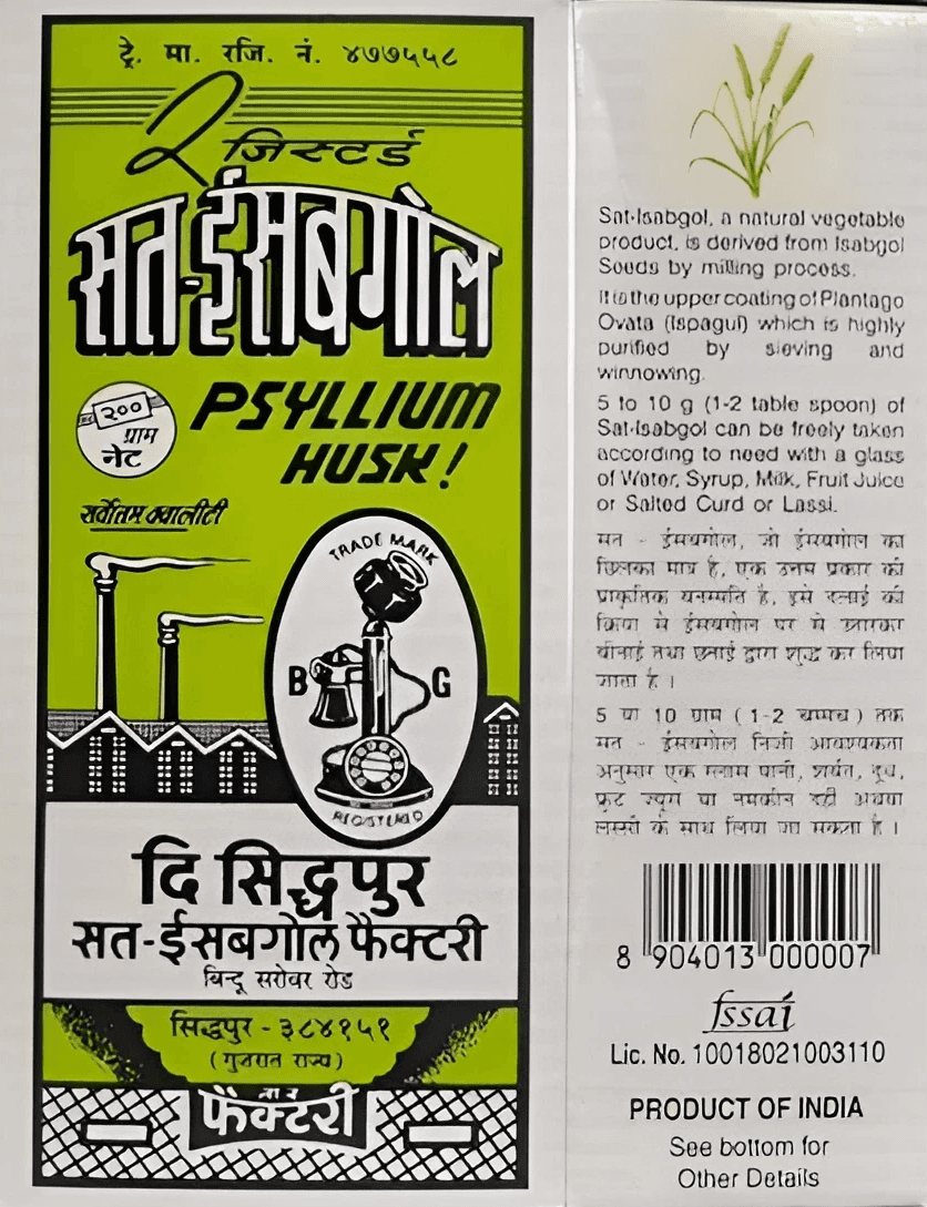
In 1920s India, when hakims were practicing traditional medicine and Sidhpur’s factories were just beginning to industrialize psyllium husk processing, a bottle design was born. Simple. Functional. Unapologetic. The Sat Isabgol bottle - looked like medicine because it was medicine. A transparent glass bottle with a minimal label, sitting in grandmothers’ altars and bathroom shelves across India.
Nearly a century later, that bottle is still there. Unchanged. Unmoved. Utterly indifferent to what modern branding would call “refreshing the identity.”
The Bottle That Marketing Forgot
Walk into any Indian household and you’ll find it. Sometimes in the bathroom cupboard. Sometimes near the kitchen. Always the same squat transparent bottle with a no-nonsense label, filled with pale beige husk that looks exactly like what it is: dried plant fiber ground to help your digestive system function.
There’s no lifestyle imagery. No promise of wellness transformed. No pastel gradients or minimalist sans-serifs. The bottle makes one claim: this is isabgol, it helps with digestion, take it with water. The packaging does not try to be anything other than what it contains.
This is remarkable in an era where every brand undergoes identity refreshes every 5-10 years. Where D2C brands launch with photoshoots that cost more than the product development. Where packaging is considered a “critical consumer touchpoint” and “brand experience moment.”
The isabgol bottle simply exists. Has existed. Will continue to exist. With the same blunt honesty it’s always had.
The Anti-Rebrand
The isabgol bottle doesn’t need you to understand design trends. It doesn’t care if you’re Gen Z or Boomer. It was there before you were born and it will be there after you’re gone. Its job is digestion. Your grandmother knew this. You know this. The bottle knows this.
There’s something deeply reassuring about a product that simply refuses to perform modernity. In a world where everything is constantly optimizing, A/B testing, pivoting, the isabgol bottle is aggressively static. It’s the design equivalent of “we are still like this only.”
What the Bottle Actually Represents
That bottle sitting in your bathroom cabinet is a time capsule. It connects you to a century of Indian households dealing with the same digestive issues in the same way. Your great-grandmother mixed isabgol with water. Your grandmother did. Your mother did. You do. The bottle hasn’t changed because the need hasn’t changed.
This is the opposite of disruption. This is continuity as strategy.
The brands that have survived - Telephone Brand (since late 1920s), Deer Brand (since 1943), Laxmi (since 1954) are family businesses that understood one thing: isabgol isn’t a category ripe for innovation. It’s a household necessity that needs to work, be affordable, and stay consistent.
They’re not trying to build a lifestyle brand. They’re supplying fiber to millions of digestive systems. The packaging reflects that utilitarian purpose with zero apologetics.
The Design That’s Not Design
The genius of the isabgol bottle is that it was never designed to be iconic. It was designed to hold psyllium husk safely, display the contents honestly, and stack efficiently in medical shops. Function determined form completely.
There’s no signature color (beyond the natural beige of the husk). No proprietary bottle shape (standard medical glass). No distinctive label design (functional text on simple paper). Yet somehow, the cumulative effect is instantly recognizable. You’d know that bottle anywhere.
This is what happens when a product category establishes its visual language early and every participant adheres to it for decades. The isabgol bottle became a category identifier, not a brand identifier. Telephone, Deer, Laxmi—they all look similar because they’re all solving the same problem in the same way.
Compare this to contemporary wellness brands where isabgol is repackaged as “organic psyllium husk” in frosted glass jars with copper lids, minimal labels in Futura, and price points 5x higher. Same product. Different story. The new packaging promises transformation. The old bottle just promises digestion.
Why It Still Works
In 2025, with quick commerce delivering design-forward supplements in 10 minutes and D2C wellness brands raising millions to reimagine ancient Indian ingredients, the unchanged isabgol bottle thrives because:
It signals reliability. If the packaging hasn’t changed in 60 years, the formula probably hasn’t either. In a category where consistency matters, this visual stability is a feature.
It’s instantly recognizable across generations. Everyone in your family knows this bottle. No explanation required. No learning curve. The visual language is shared across age groups.
It doesn’t try to be something it’s not. It’s not a wellness lifestyle product. It’s not aspirational. It’s digestive fiber. The packaging is honest about that reality.
It’s trusted through repetition. You’ve seen this bottle your whole life. It was in your grandmother’s house. It’s in your house. It will be in your children’s house. That multigenerational presence creates a bond that branding can’t manufacture.
The Quiet Rebellion
In an industry obsessed with “premiumization,” “brand refreshes,” and “design-led differentiation,” the isabgol bottle’s refusal to change is quietly radical. It suggests that maybe, just maybe, some products have reached their final form. That the best packaging for certain categories is the one that transparently shows what’s inside and makes no promises beyond function.
The bottle doesn’t need to compete for shelf space at Whole Foods or earn a Dieline award. It sits in the back of the bathroom cupboard, does its job, and gets refilled when empty. The opposite of unboxing experiences. It’s a bottle you buy because you need what’s inside, not because the outside delights you.Somehow, in its complete indifference to contemporary design trends, it has become iconic.
What We’re Really Buying
When you pick up that isabgol bottle at the chemist, you’re buying more than psyllium husk. You’re buying continuity in a world that won’t stop changing. You’re buying the same solution your grandmother used. You’re buying a visual anchor that connects you to decades of Indian households managing the same unglamorous reality: digestion needs maintenance.
The packaging makes no attempt to elevate this reality. It doesn’t pretend isabgol is anything more than fiber that helps things move along. And in that brutal honesty, in that refusal to dress up function with aspiration, there’s a kind of design integrity that modern branding has mostly lost.
The isabgol bottle represents an era when products didn’t need to be experiences. When packaging just needed to protect contents and communicate clearly. When medical supplies looked like medical supplies, and that was enough.
Six decades later, it’s still enough.
The bottle that marketing forgot is the bottle that never needed marketing in the first place. It just needed to be there, consistently, doing what it’s always done.
And it is.
From the Archives is Reborn Goods’ look at Indian packaging design that became iconic by refusing to change. These are the visual anchors that connect generations, the designs that work precisely because they’ve never tried to be anything other than what they are.

Let’s keep in touch.
Discover more. Follow us on Substack and Instagram.