Protein this. Protein that.
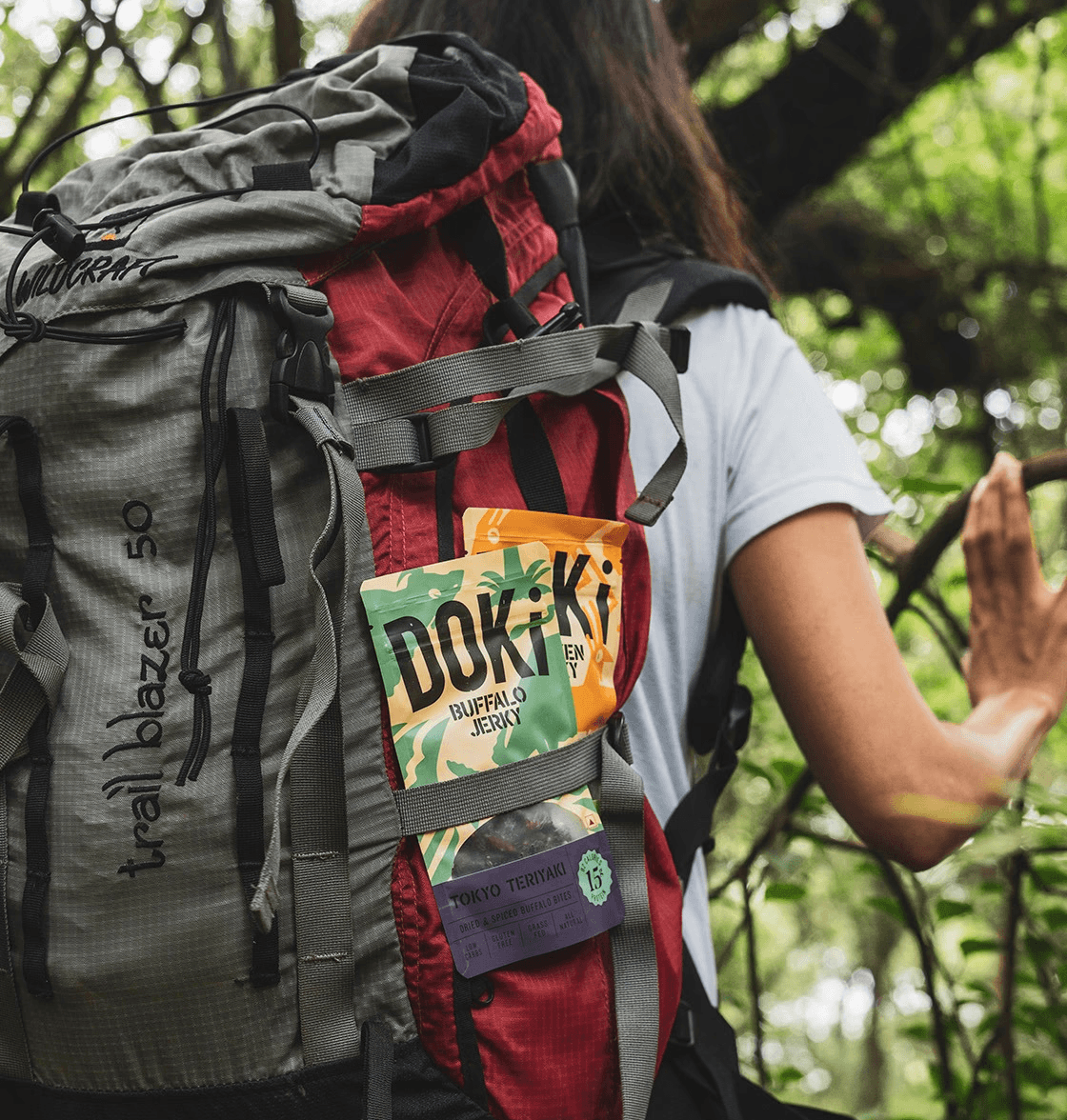
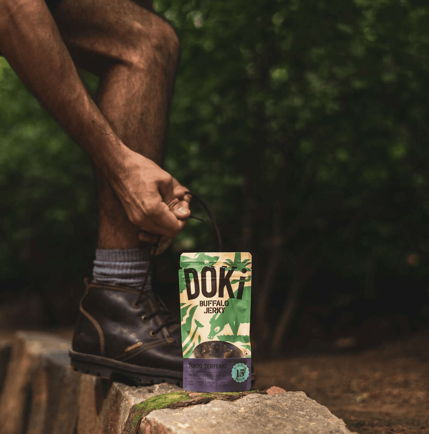
Doki doesn’t present meat as a raw ingredient. It presents it as a ready-to-use lifestyle component.
In food, design does more than look good and it builds credibility and signals trust. Doki’s visual language leans clean, modern, and minimal. No over-the-top farm imagery. No exaggerated “rustic” tropes. Just clarity.
When you’re selling something as sensitive as meat - hygiene, freshness, quality, visual simplicity becomes a crucial. Doki is solving for the new urban consumer that wants convenience, consistency and transparency.
The protein wave isn’t slowing down. It’s expanding. However, growth doesn’t come from adding more SKUs. It comes from reframing categories.
Doki is selling structure - routines, habits, reliability. That’s how everyday products turn into repeat purchases. That’s how food becomes part of identity.