FAE Beauty: Inclusivity as Infrastructure, Not Messaging
Builder
/
Please See
Distribution Channels
/
Physical Retail
/
E-Commerce
/
D2C Website
Category
Beauty & Personal Care
Funding
Series A Stage

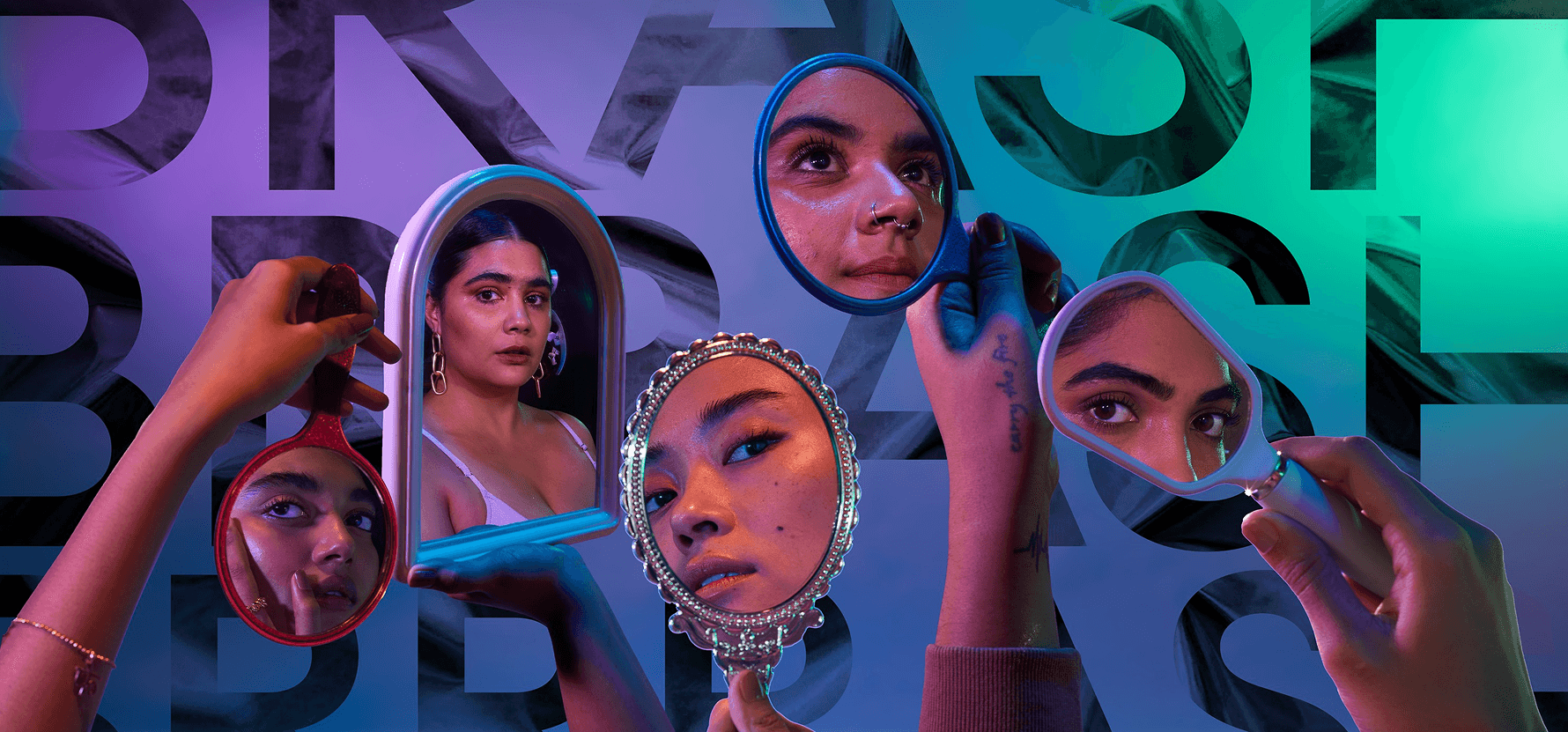
Karishma Kewalramani grew up in Mumbai navigating colourism - the quiet hierarchy within brown skin that rewards lighter tones. Then she spent years working in the US, where she noticed something that should have been obvious but wasn't: beauty brands there formulated for different undertones, different textures, and talked about it honestly. Walk into a cosmetics store in India, and foundation shades still cluster around fair skin, as if the rest of the country's skin tones were an afterthought.
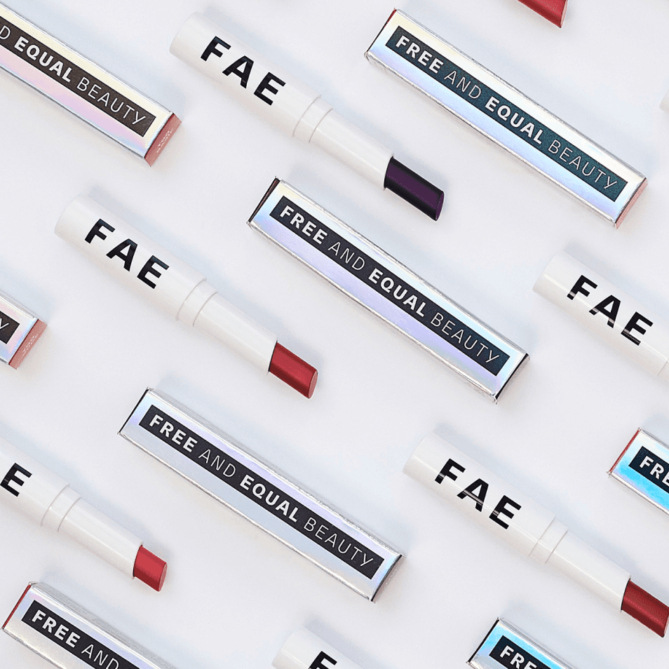
That gap is what FAE Beauty was built to close. Founded in 2019, the name stands for Free And Equal and the brand has spent six years treating that as a design brief, not a slogan.
+
What Inclusivity Actually Required
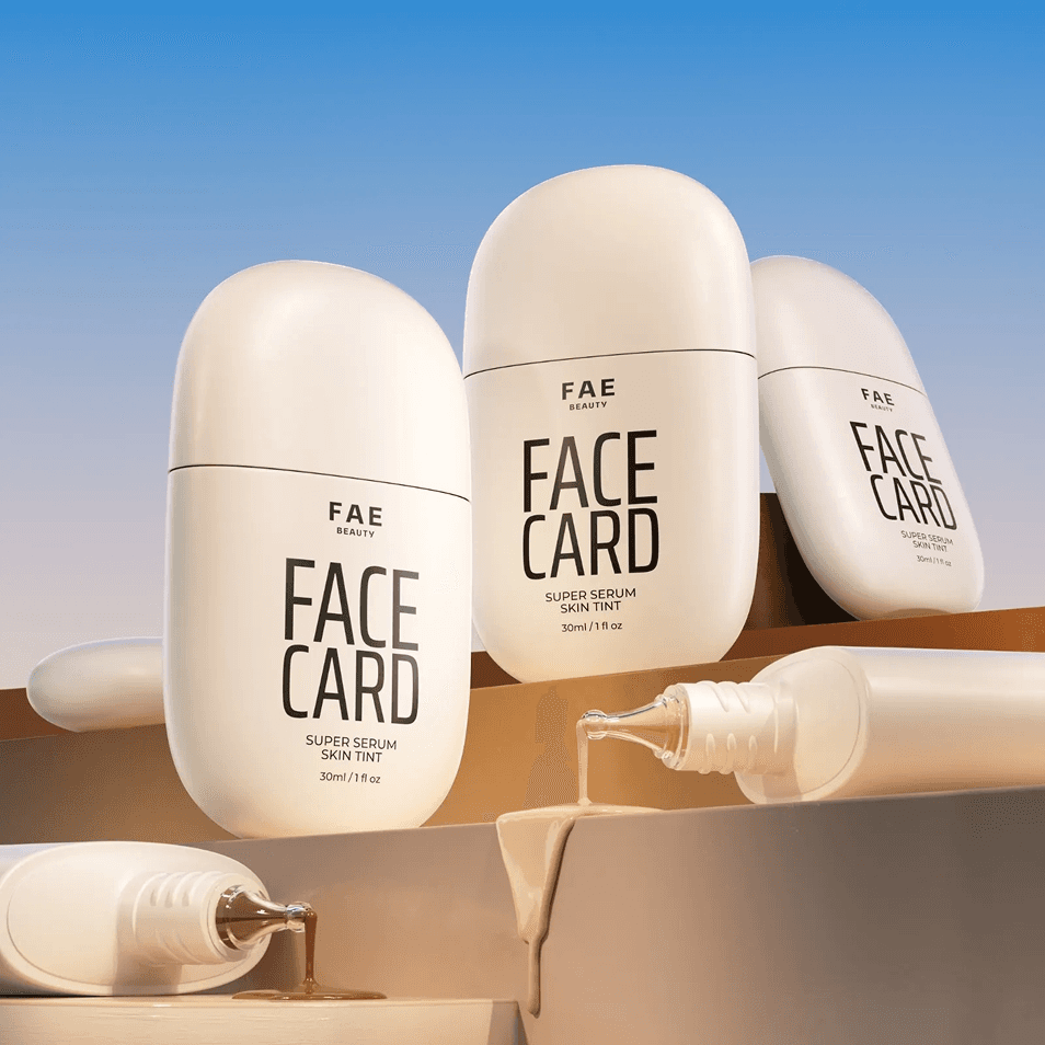
Most brands that talk about inclusivity mean a wider shade range in their foundation line, photographed once for a campaign. FAE built inclusivity into the products themselves, skincare-infused formulations designed for Indian skin tones, undertones, and climate, with shade ranges developed to actually work rather than offer something "close enough."
The harder commitment is visual. FAE's campaigns use real skin- pores, texture, unfiltered; without retouching. In a category built on airbrushed perfection, this is a structural choice that shapes how every image is shot, approved, and published. It also means the brand can't quietly slide back into old habits during a big campaign, because the standard is the standard.